Microblading by
Bojana Ana Nikolin
We are more than proud of our engagement by US leading Microblading artist Bojana Ana Nikolin. Our talented digital team was occupied with creating a completely new look and feel for the queen of Microblading.
Responsive.
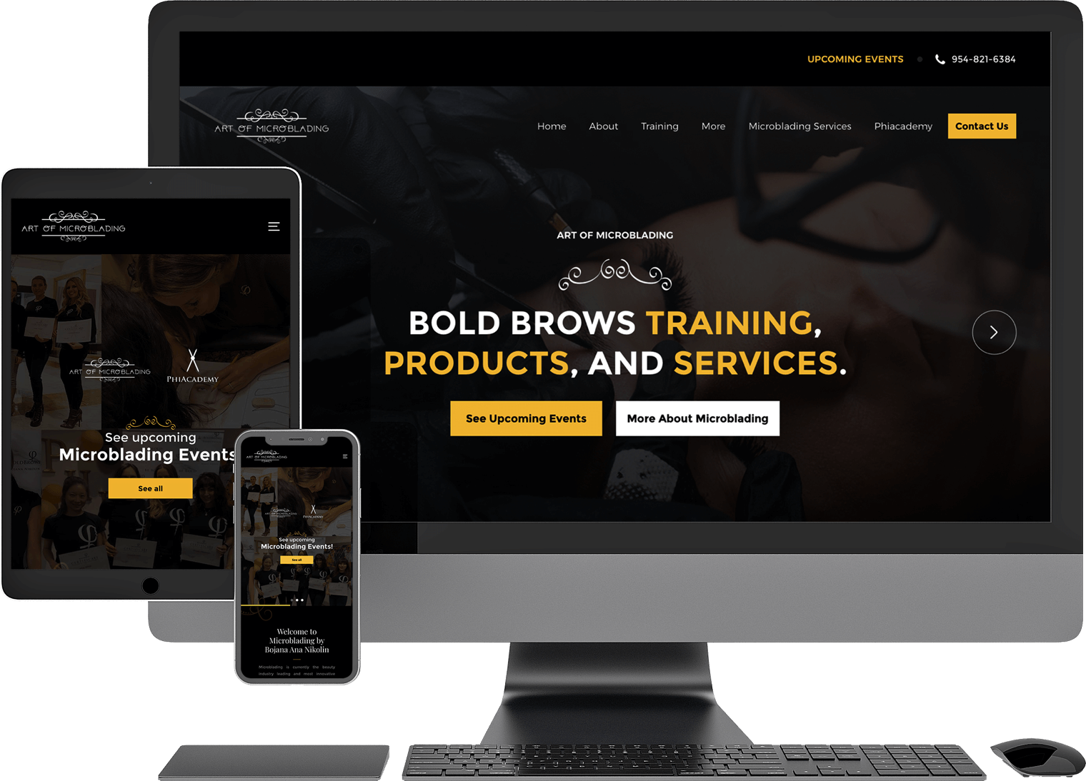
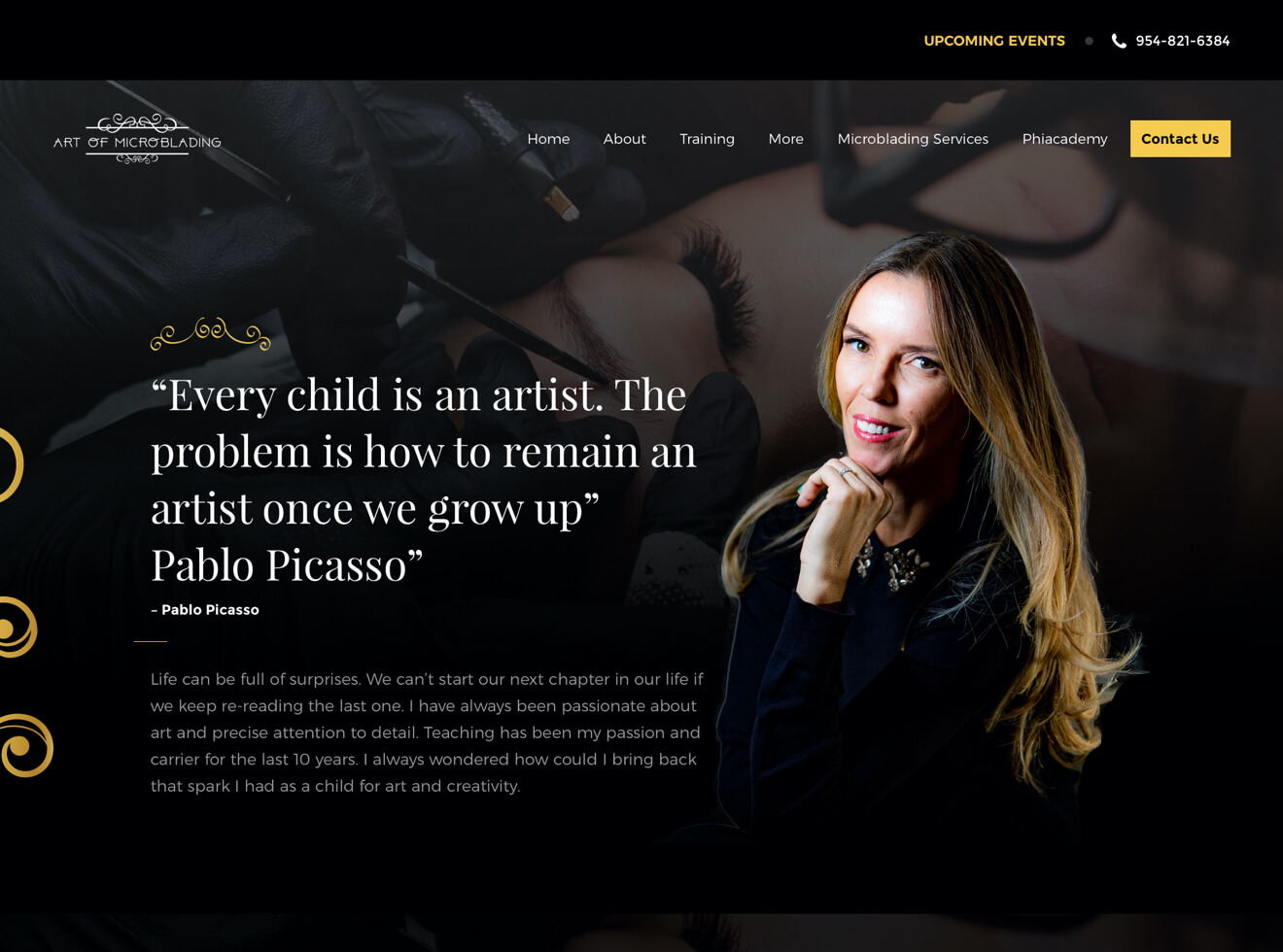
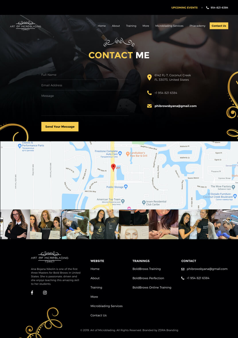
Ana Bojana Nikolin is one of the first three Masters for Bold Brows in the United States. She is passionate, driven and she enjoys teaching this amazing skill to her students.
Industry
- Beauty
Technologies used
- WordPress
- Adobe Photoshop
- Adobe Illustrator
- Sketch
Involvement/Role
- Website Design
- Website Development
Approach.
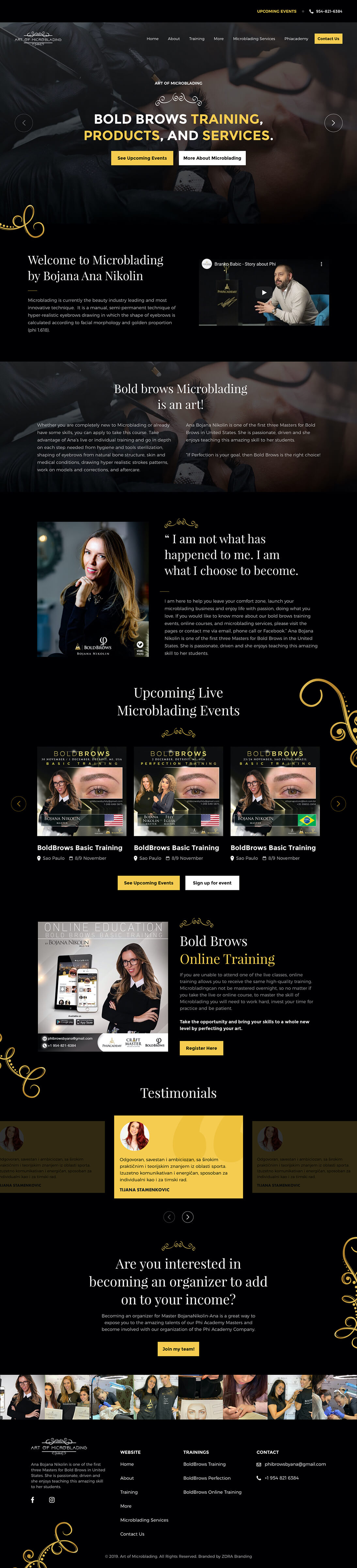
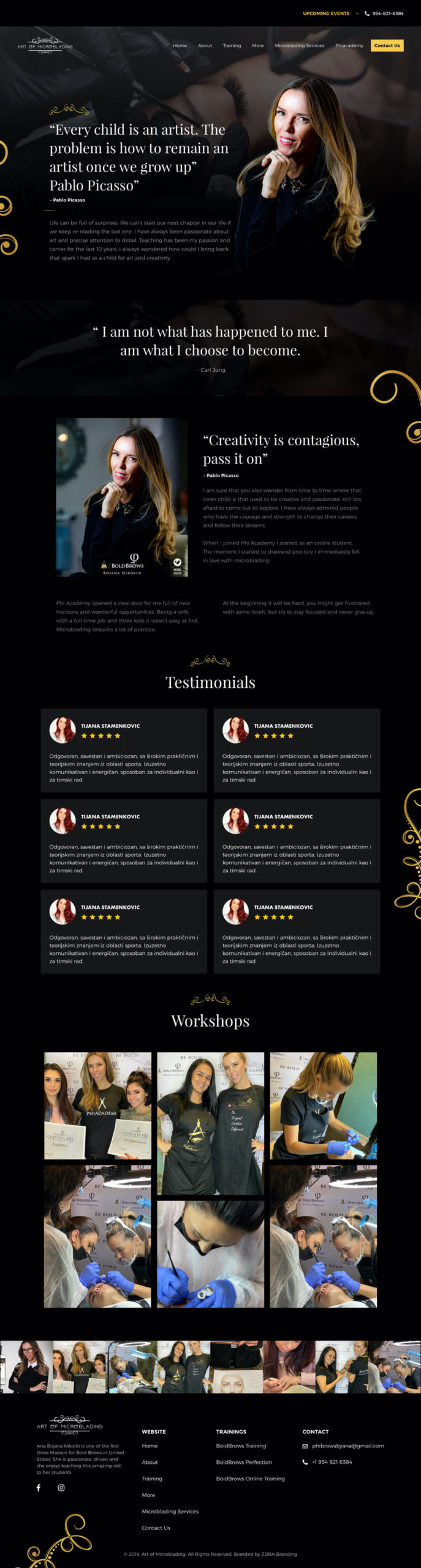
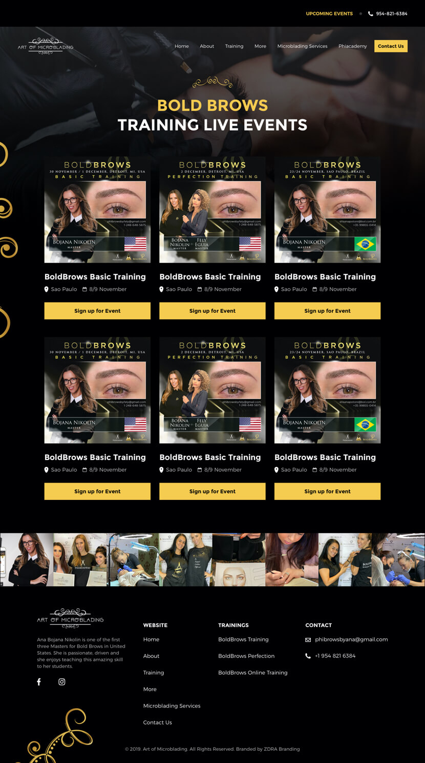
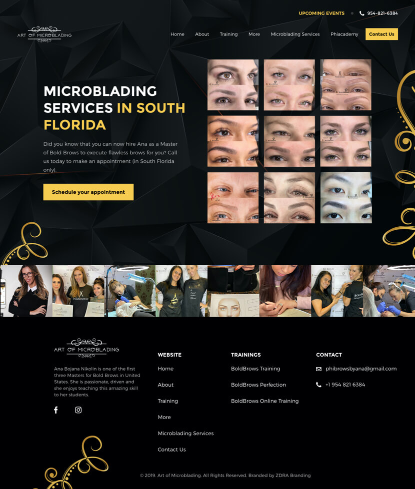
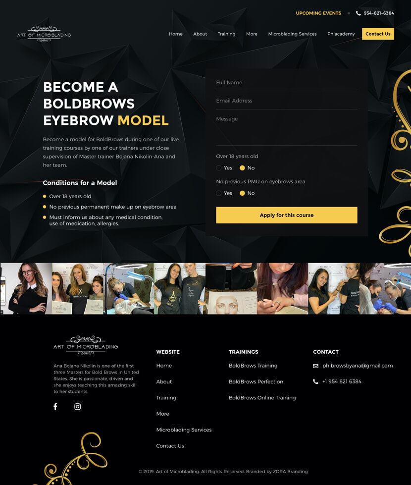
We helped Bojana Ana Nikolin recreate her website, combining simplicity and flexibility into an easy signing up process. We wanted to transmit as much information a customer needs to successfully sign up for events/courses. The fixed main page gives the user easy access to three categories of events while being able to smoothly scroll amongst the rest of the events.
Keeping in mind the main user personas – women who want to learn Microblading. We made the whole website styling following the target audience. It all came together beautifully with a fresh, clear, and vibrant user interface.
Typo & Palette.
We selected a set of strong and bold colours that maintain the level of seriousness this work requires, whilst still being desirable and attractive to all audiences.
Titles
H1, H2, H3…


Titles
H1, H2, H3…

Body
Paragraphs


Body
Paragraphs

Yellow
#F7CB4F
Black
#000000
White
#FFFFFF
Website.
Satisfied Client.
Satisfied
Client.
I had been completely stuck on the right personality for my business and therefore needed help. ZDRA Branding taped into my vision, and their brand direction ideas were really strong. It was a smooth process to the final website design and online presence guidelines in which I feel fully invested and able to work easily as the business develops.
– Ana Bojana Nikolin, Owner @Microblading by Ana Nikolin.
Project is live.
In the process of creating a new website, the first thing we focused on was creating a reversed colour scheme, adding a darker text on a light background to give a fresh, distinctive feel.
Scroll